Design-Centric
RATIONALE
Brand Vision


Origins
The brand vision of Big School USA began in the researcher’s graduate letterpress course, in which students designed and printed posters that captured the essence of the design-centric solution. A series of 3 posters led to the central concept: American educators lack the resources and guidance to interact with Chinese international students.


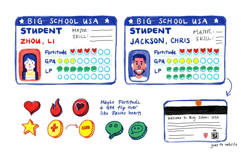
The “Big School”
The name, Big School USA, was selected because “big school” is the simplified, literal translation of the Chinese term 大学 daxue, which translates to “university.”
Brand Personality
Educational
Big School USA aims to inform American higher-education faculty about the common challenges that Chinese and other international students face at their host institutions.
Engaging
By incorporating an appealing visual style, accessible language, and humor, the simulation should create a welcoming, engaging environment for participants.
Inclusive
One of the main goals of Big School USA is to foster a sense of inclusivity and civility in the higher education space through educator empathy.
Empowering
Participants in Big School USA should not only develop empathy for their Chinese students but also feel empowered to make adjustments in their teaching methodologies.
Logo Development
Chinese Seals
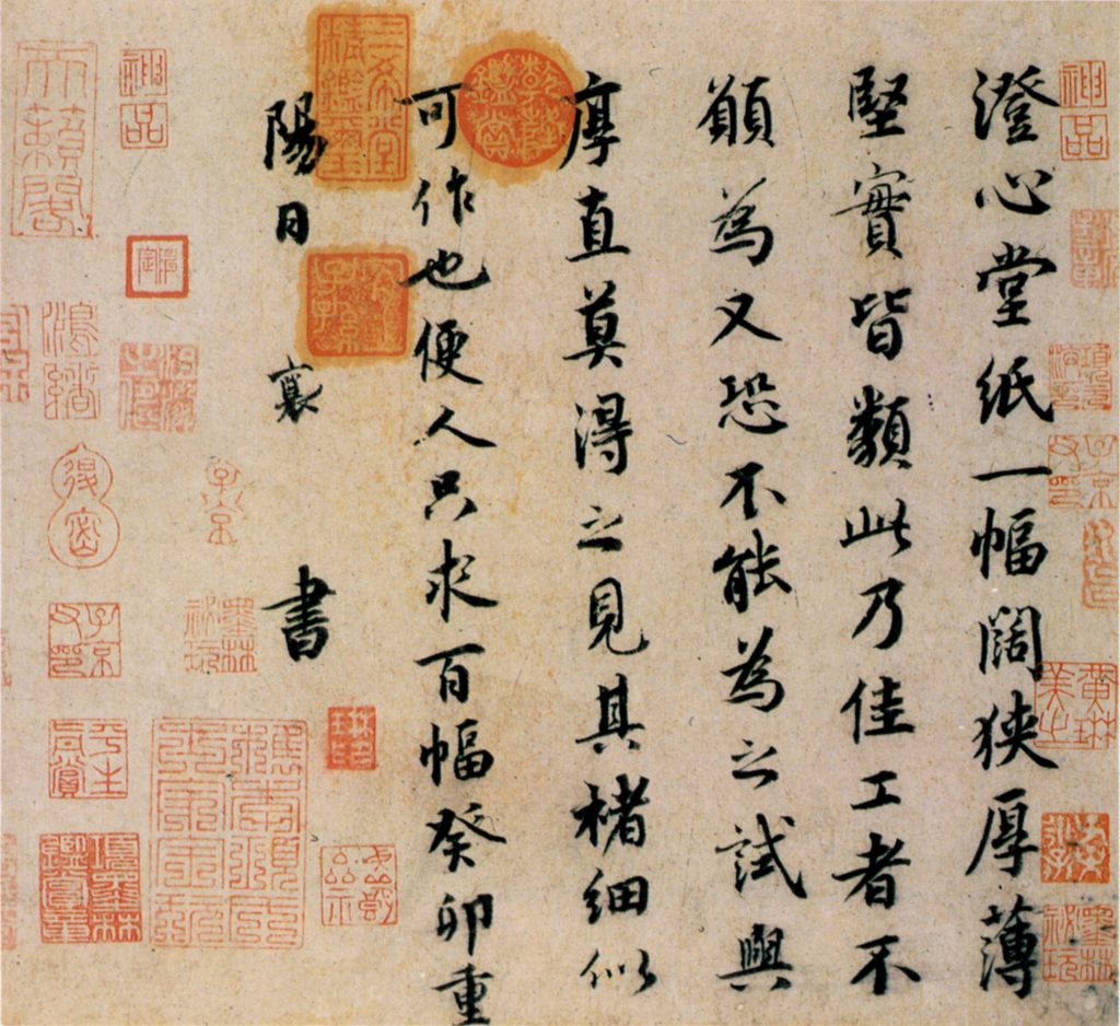
The Big School USA logomark was designed to emulate a traditional Chinese seal, similar to an official signature.
Western Crests
While Chinese seals are usually square or circular in shape, the Big School USA logo is shaped similarly to a Western shield or crest, a feature in the logos of many higher-education institutions around the world.
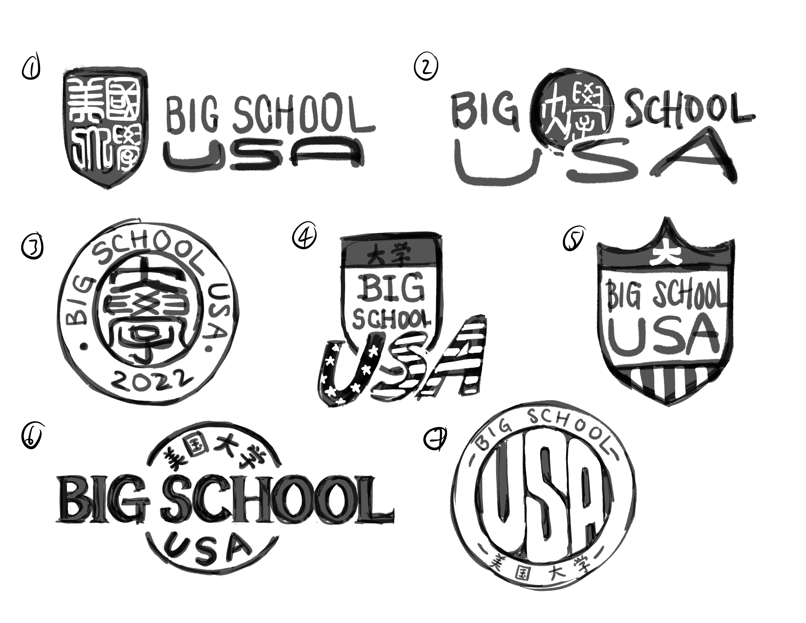
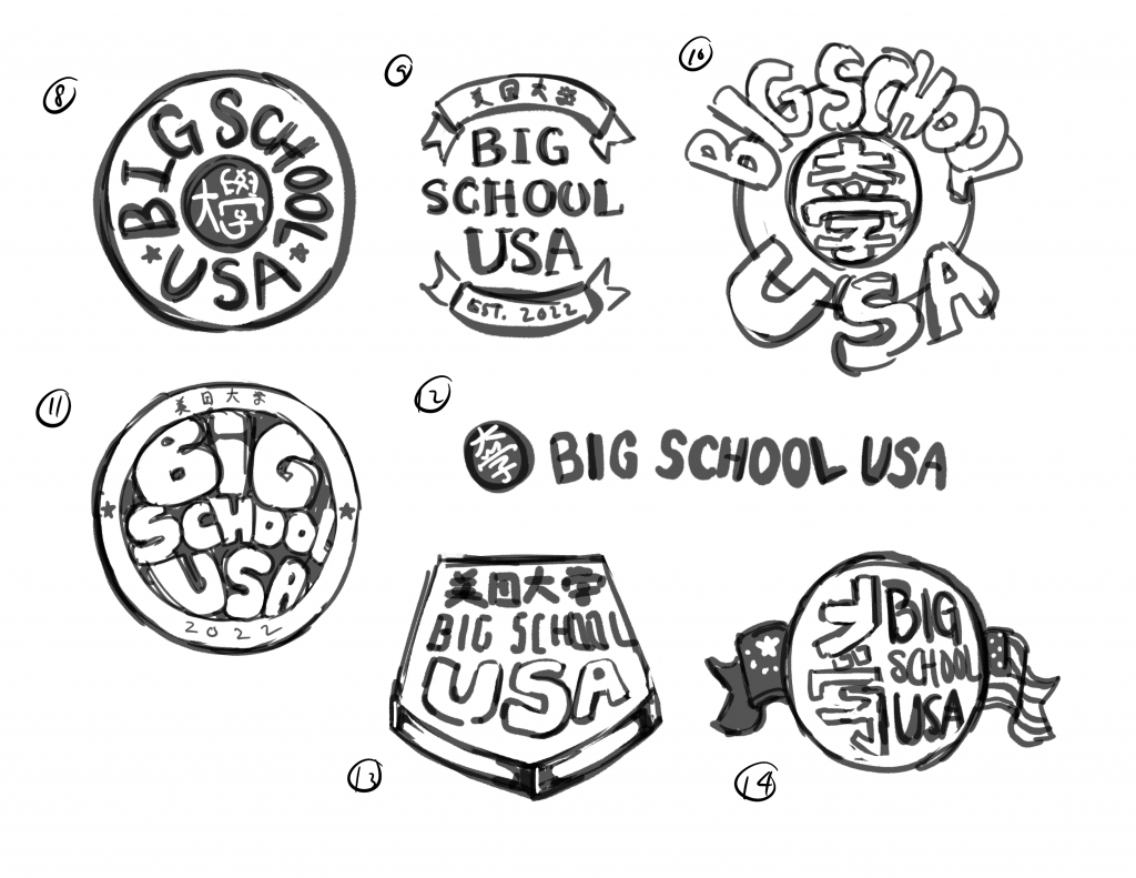
Final logo
Typography
Noto Sans
Google’s Noto is a free, open-source font family conceived with the mission of “[providing] a beautiful reading experience for all languages” (“Noto Fonts”). The Noto family is versatile and also optimized for on-screen readability.

Noto Sans Display Bold
Noto Sans Regular
Noto Sans Simplified Chinese
Color Palette and Textures
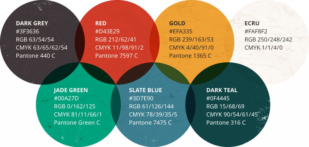
Colors
The colors and textures featured in Big School USA were based on Chinese visual culture and were chosen to attract a more mature audience. Aside from the eye-catching warm red and jade green, Big School USA features the more muted colors of gold, slate blue, teal, and warm grey.
Textures
Textures add another layer of depth and complexity to the visual language of Big School USA. The featured textures all come from the researcher’s scans of authentic, Chinese handmade papers.
Graphic Elements
Illustration Style
The style of illustration used throughout Big School USA pays homage to contemporary Chinese illustrators, namely Lisk Feng, Feifei Ruan, and Victo Ngai. The shape language is simple and organic, and line elements are used sparingly. The layering of the shapes of color creates visual depth, alluding to traditional printmaking techniques.
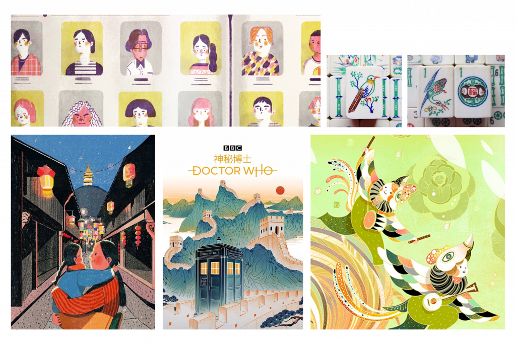
Illustration moodboard

Illustration detail #1

Illustration detail #2

Illustration detail #3
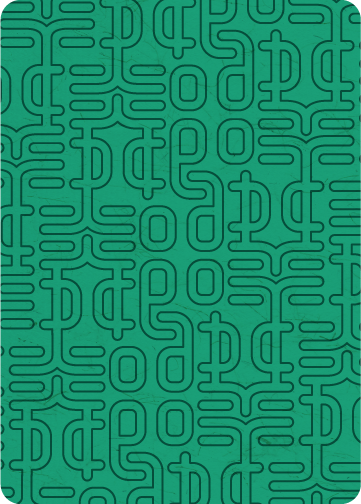
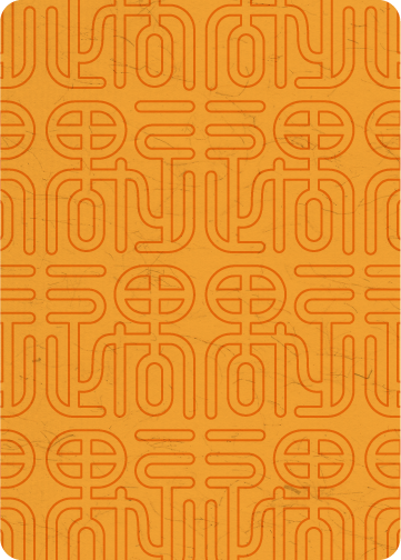
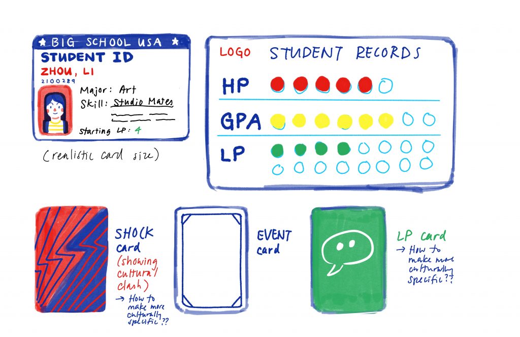
Patterns
A series of line-based patterns was designed mainly for the different card backs. The motifs are characters written in a specific style of ancient Chinese seal script (the characters 邻, 遇, and 易, respectively).
Lingo Card back (邻 = lin “neighbor”)
Encounter Card back (遇 = yu “encounter”)

Confucian Card back (易 = yi “change”)
Simulation Mechanics & Components
Ideation
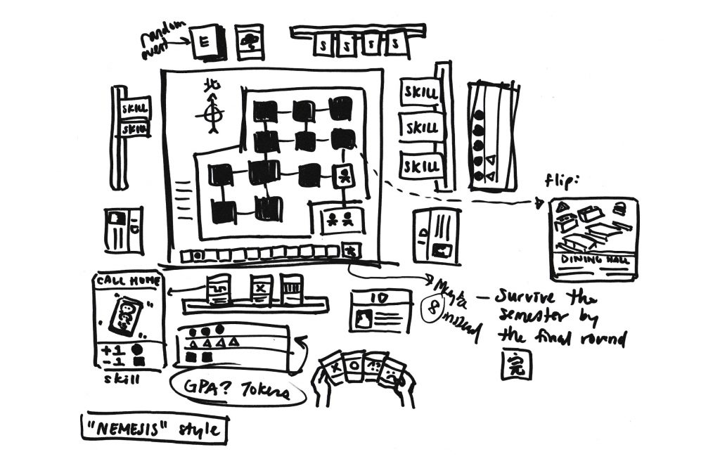

Inspiration
The Big School USA simulation’s mechanics and components were inspired by existing traditional games. After in-depth research, two particular games served as the basis for the final game-based solution.
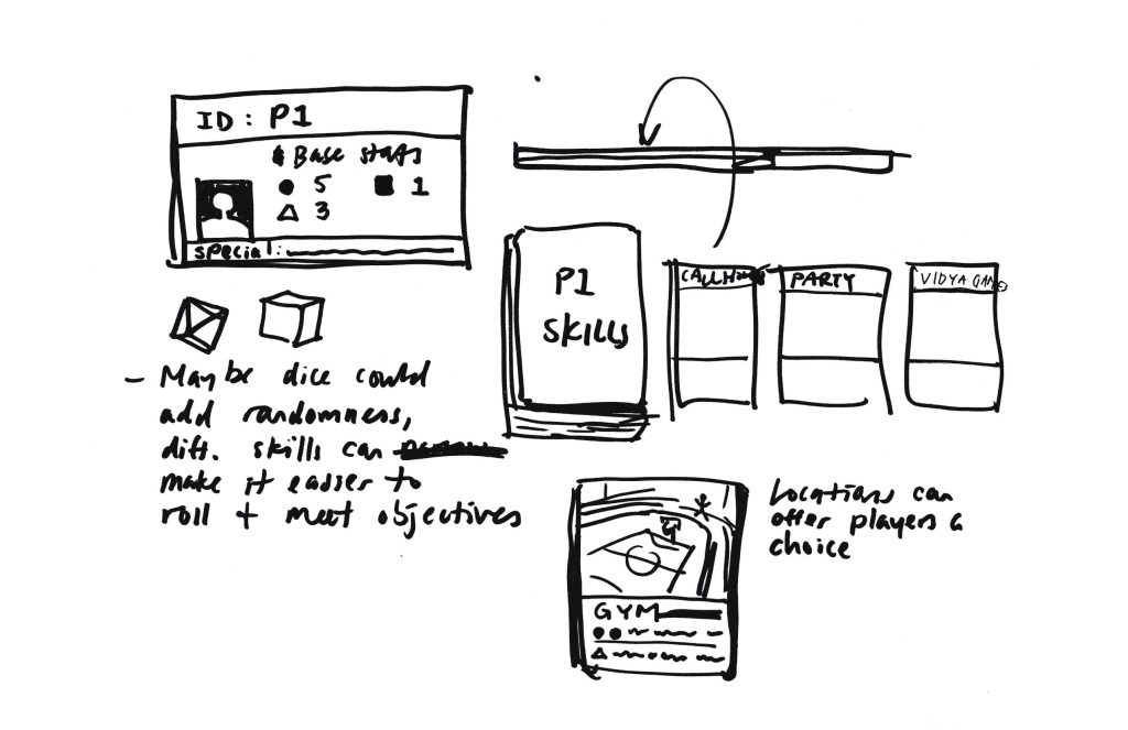
Ravine
The game Ravine (by Stellar Factory) informed many aspects of the simulation, including:
- Collaborative gameplay
- Simplistic aesthetic
- Accessible and humorous tone
- Use of different card types, especially “Madness” cards
- Element of luck
- Survival mechanics

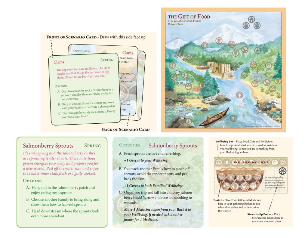
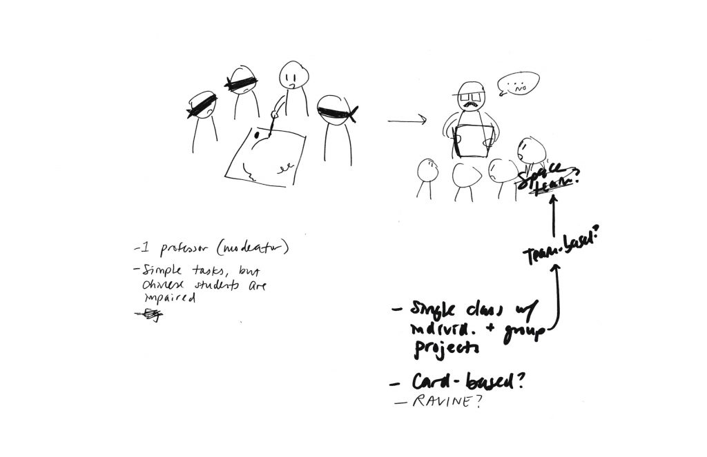
The Gift of Food
Meanwhile, Big School USA’s Encounter Cards (featuring multiple options and consequences) and cross-cultural elements were directly inspired by the serious game The Gift of Food. It was developed by Elizabeth LaPensée to impart knowledge about Pacific Northwest indigenous cultures.